Alpha Kappa Psi Marketing

Overview
I have been part of three design teams for UCLA’s Alpha Kappa Psi, one of the oldest and most established co-ed professional fraternities in the nation. Each quarter, our goal remains the same -- to create marketing assets for the upcoming recruitment campaign -- but the process, challenges, and outcome for each quarter are always different. Each time, I strive to develop my visual design skills and to learn how to brand an organization more effectively.
Role
Lead designer
Category
Visual design
Time frame
Fall ‘17, Spring ‘18, Fall ‘18
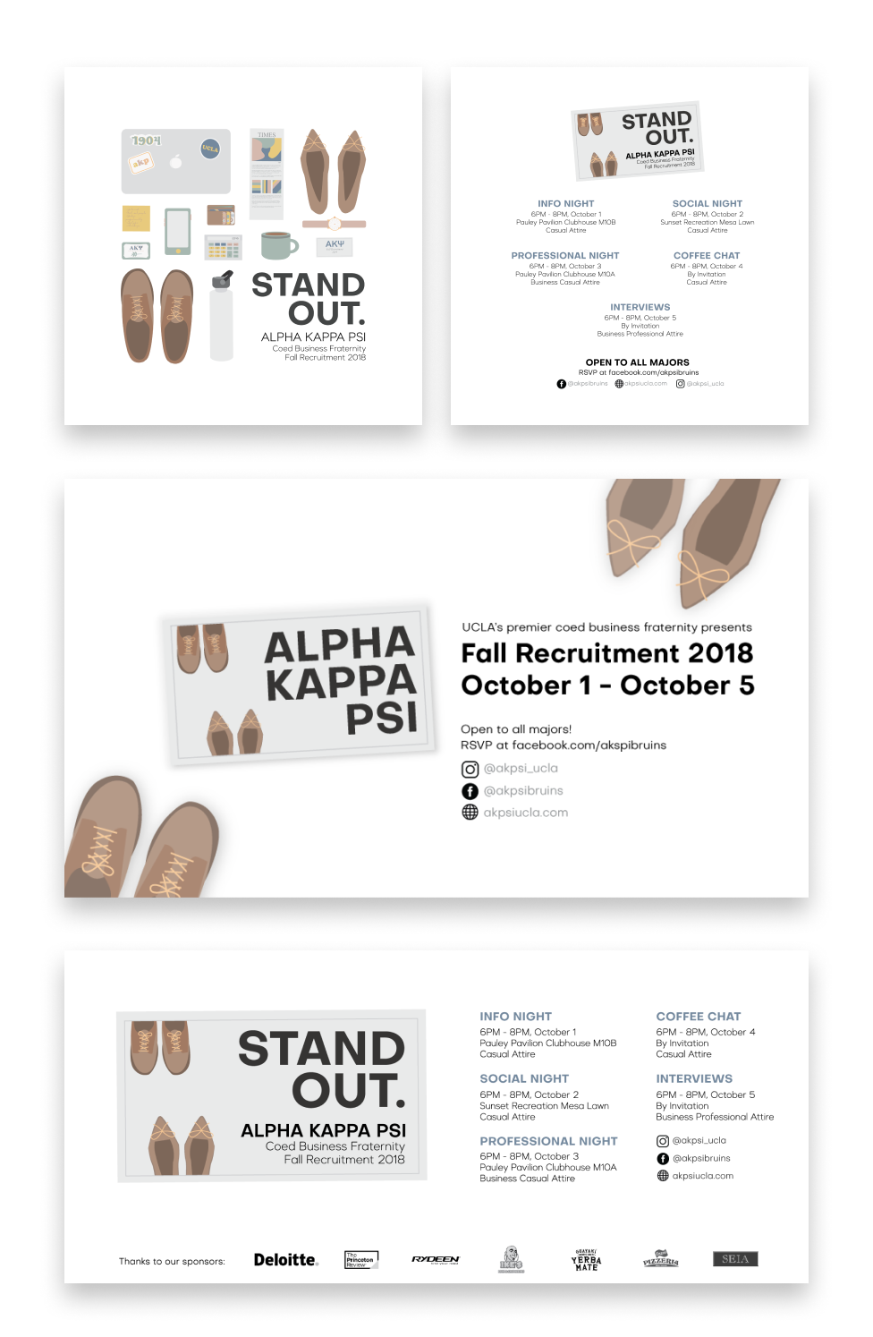
Fall 2018 — "Stand Out"
Problem space
The theme this quarter was bold and unapologetic. The previous two quarters chose themes that described the purpose of our fraternity, but this quarter’s tagline, “Stand Out,” was a direct challenge to students. We wanted to convey a message of empowerment and support, a call for them to showcase what makes them unique. We also wanted to show why our fraternity stood out amongst the 6 other professional fraternities vying for recruits this same quarter.
Design process
My teammate Leslie Yen and I decided that we wanted to go for a graphic, minimalistic style so that our tagline could speak for itself, and because it would be drastically different from the typically photo/icon-centered style that other fraternities typically branded themselves with. We began with designing the flyers, which would set the theme for all other assets. Leslie took charge on illustrating each item, and I revised each item to be more cohesive together and with the theme.

We liked the narrative that the collection of items told. The items were professional and millennial (cue the white Hydroflask, stickers on the laptop, and iPhone), so we balanced that with a warm and natural color palette. However, it was proving more difficult than expected to create an organized layout of the items and making the negative space between each item consistent. We went through tens of drafts pixel-pushing and switching items from place to place to find one that was visually balanced and reflected our theme.
Deliverables
The theme this quarter was bold and unapologetic. The previous two quarters chose themes that described the purpose of our fraternity, but this quarter’s tagline, “Stand Out,” was a direct challenge to students. We wanted to convey a message of empowerment and support, a call for them to showcase what makes them unique. We also wanted to show why our fraternity stood out amongst the 6 other professional fraternities vying for recruits this same quarter. Below from top to bottom are the final flyers, digital display, Facebook cover photo, and t-shirts!

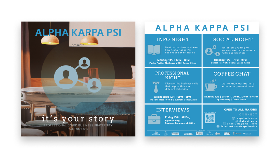
Spring 2017 — "Shaping People, Shaping Business"
Problem space
Fresh off the previous campaign, I gathered input specifically from the newest members to see how the previous marketing had impacted them. The consensus was that the individual graphics were informational, but the collection itself from social media to print lacked a cohesive voice. And similar to the previous quarter, we had to balance branding with the theme we chose for this recruitment: “Shaping People, Shaping Business.”
Design process
I established some key guidelines for the new interns of the design committee based off challenges and input from the previous quarter. I wanted to make sure that at each stage of development, we would prioritize our objective and vision, which would help us fairly evaluate and critique possible designs.

We wanted our graphics to exude a strong sense of professionalism and dynamism, so we experimented with various color palettes and textures.
Deliverables
Ultimately, we chose to use a combination of charcoal and dark wood for a sense of refinement and a more mature tone because they were most clearly in line with our final theme, “Shaping People, Shaping Business.” Unlike the previous campaign, we focused on engaging a more specific audience: students who were most attracted to the professional aspect of Alpha Kappa Psi. Below are the final designs for the flyer, digital display, and Facebook cover photos.

Fall 2017 — "it's your story."
Problem space
The main challenges we faced was the lack of design experience. Members of the team only had experience with social media marketing, and mine comprised of Canva and a fine arts background. The lack of structure and experience made it difficult to get useful critique and consensus on ideas that we wanted to move forward with.
Design process
We experimented with various illustrations to evoke a sense of creation and of a work in progress. I watched many hours following tutorials on YouTube and Lynda to learn how to use Photoshop and Illustrator, and started reading articles on branding and visual design fundamentals on Medium.

However, after talking to unaffiliated students, we realized that these initial designs did not represent the professional qualities of the fraternity, and those who had never heard of the fraternity were confused about the organization’s values. As a result, we chose not to move forward with our illustrations, and opted for a more obvious connection to the largest audience possible. This influenced our designs to feature images from the workplace and simple icons to represent the values of the fraternity.
Deliverables
In the end, we decided to stick with a combination of spacious images and icons to create a warm and inviting tone. We felt confident that these graphics would speak to a larger audience. Our recruitment campaign went successfully, as we inducted an awesome new class!
Below are the set of flyers, Facebook cover photo, and digital display that we created.
Below are the set of flyers, Facebook cover photo, and digital display that we created.


Reflection
Over the past year and a half working on these three campaigns, I have learned so much about communicating visually and making a lasting impact on observers. It began in Fall 2017, the first time I had ever used Photoshop. There was definitely a learning curve, but I enjoyed every minute that I spent following YouTube tutorials.
Now, I can see the improvement from quarter to quarter, especially in terms of visual balance and execution of the campaign themes. I’m still far from having a complete skill set, but I hope to keep improving as a designer with each quarter. And of course, special thanks to my fraternity for giving me these opportunities!
Now, I can see the improvement from quarter to quarter, especially in terms of visual balance and execution of the campaign themes. I’m still far from having a complete skill set, but I hope to keep improving as a designer with each quarter. And of course, special thanks to my fraternity for giving me these opportunities!

